When it comes to interior design, color isn't just about aesthetics—it's a powerful tool that can shape our emotions, moods, and perceptions within a space. The study of color psychology delves into the impact different hues have on our well-being. Our design advisors took a deeper dive into the fascinating world of color psychology in interior design, helping you choose the perfect color schemes to create the desired atmosphere in your home.
Before diving into the psychology of specific colors, let's explore the broader concept. Color psychology studies how colors can affect human behavior and emotions. It's a field that's been embraced by interior designers, marketers, and even healthcare professionals to influence our well-being.

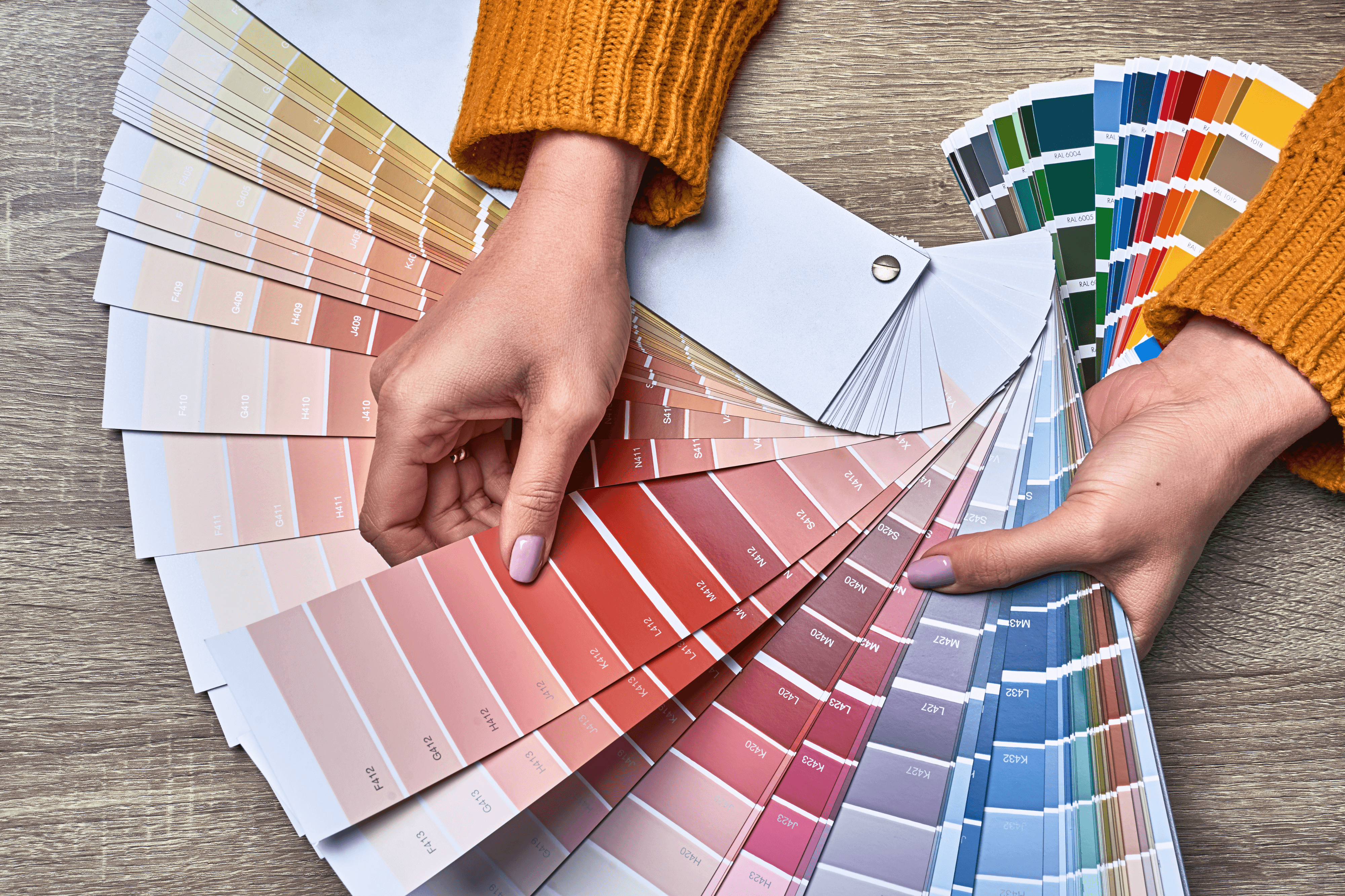
Image source: Canva
The psychology of colors
Now, let's take a closer look at how individual colors can evoke specific feelings and moods:
Blue: Often associated with calm and serenity, blue is a perfect choice for bedrooms and bathrooms. Lighter blues can create a sense of tranquility, while darker blues add depth and sophistication.
Green: Green is the color of nature and represents growth and harmony. It's an excellent choice for spaces where you want to create a sense of balance and relaxation, such as living rooms or home offices.
Red: Red is a bold, energetic color that stimulates the senses. Derived tones such as pinks and fuchsias also bring energy into a space. It's ideal for spaces where you want to encourage conversation and activity, like dining rooms or kitchens.
Yellow: Yellow is known for its cheerful and optimistic qualities. It can bring warmth and positivity to kitchens, dining areas, or even home offices.
Neutral colors: Whites, grays, and beiges are versatile neutrals that can create a sense of simplicity and elegance. They serve as excellent backdrops for other colors and are often used in living rooms and bedrooms.
Successful color-driven designs
Let's explore some real-life examples of color psychology in action:
Relaxing retreat: A bedroom with soft hues, muted grays, and other neutrals creates a tranquil and restful atmosphere, perfect for unwinding after a long day.

Marie doors in earthy sand on two Sektion cabinets put together, with Agnes chrome pulls from Norse Interiors.
Energizing kitchen: A vibrant pink accent wall in the kitchen adds a sense of energy and excitement, making it an inviting space for cooking and socializing.

Image source: Canva
Nature-inspired living room: A living room adorned in various shades of green and wood tones evokes a feeling of being surrounded by nature, fostering a sense of balance.

Marie doors in luxe green on two 25"H Besta frames put together, with Cornelia black pulls from Norse Interiors.
Productive home office: A bright and neutral home office promotes productivity and leaves room for creativity, making it an inspiring and organized workspace.

Cane doors in white lace on 75"H Besta frame and Elisabeth brass knobs with a handmade desk by @jensgatheringnest in between.
Selecting the right color schemes
Choosing the right color scheme for your interior spaces depends on your goals and the atmosphere you want to create. Here are some guidelines to help you get started:
Consider room function: Think about the purpose of the room. Is it a space for relaxation, productivity, or socializing? Choose colors that align with the room's function.
Balance and contrast: Create balance by using a combination of light and dark shades. Contrast can add visual interest and depth to a space.
Go monochromatic: Monochromatic color schemes involve using different shades of the same color. This creates a harmonious and visually appealing look.
Use the 60-30-10 rule: A common rule in interior design is to use 60% of one dominant color, 30% of a secondary color, and 10% of an accent color for visual interest.

Astrid doors in silver sage with Sara brass legs and Agnes brass pulls on two IKEA Besta frames put together.
At Norse Interiors, we understand that color plays a crucial role in interior design. Our customizable furniture pieces are designed to complement a wide range of color palettes, allowing you to create spaces that look stunning and nurture your well-being. Incorporating color psychology into your interior design decisions can elevate your home to new levels of comfort and style. By harnessing the emotional and psychological effects of colors, you can transform your home into a haven of well-being and beauty.
Schedule your 1-on-1 design consultation and talk color with a design advisor. Book now.
--------------------------------------
You might also like Bringing hygge into your home.
For more inspiration, follow @norseinteriors on Instagram and TikTok